Custom Cursor
You've made a theme and all that is left is to make the cursor match the style.
The cursor exists of two panes: P_Main and P_Grow. These can be found in Cursor3.bflyt (every szs has one). P_Grow is positioned on top of P_Main and both are always enabled.
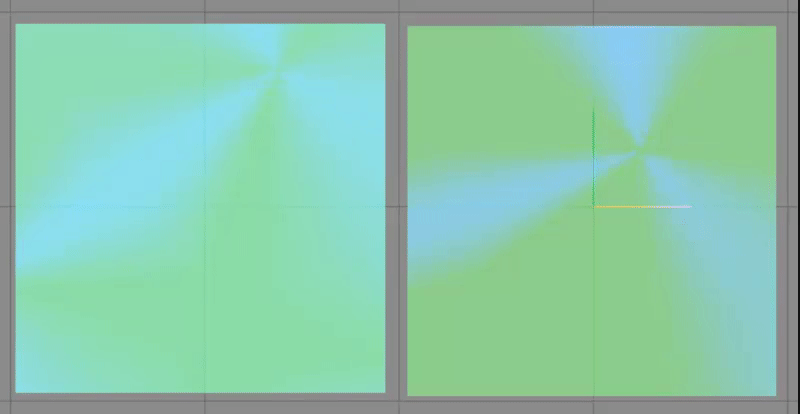 The two layers P_Main (left) and P_Grow (right) separated
Info
Note that
- BackgroundColor (Switch Layout Editor) == White Color (Switch Toolbox)
- ForegroundColor (Switch Layout Editor) == Black Color (Switch Toolbox)
These two fields can be found under the Materials section in both programs.
Examples (Simple)
Important
- Since the color format is actually
aabbggrr(alpha, blue, green, red) you'll have to use a reversed version of the normal hex color. For example, the hex color code0000FF(rgb)/0000FFFF(rgba) would becomeFFFF0000(abgr).
Animated
This example keeps the stock animation and only changes the colors.
You need four colors: two base colors and two slightly lighter variants (see Advanced Step 1)
Warning
DO NOT change the alpha channel in this example (keep the FF and 00). Only modify lowercase bbggrr.
{
    "TargetName": "ResidentMenu.szs",
    "Files": [
        {
            "FileName": "blyt/Cursor3.bflyt",
            "Patches": [
                {
                    "PaneName": "P_Main",
                    "UsdPatches": [
                        {
                            "PropName": "C_B",
                            "PropValues": ["0", "0", "0", "0"],
                            "type": 1
                        },
                        {
                            "PropName": "C_W",
                            "PropValues": ["0", "0", "0", "0"],
                            "type": 1
                        },
                        {
                            "PropName": "S_BorderColorSelect0",
                            "PropValues": ["0"],
                            "type": 1
                        },
                        {
                            "PropName": "S_BorderColor0",
                            "PropValues": ["0", "0", "0", "0"],
                            "type": 1
                        },
                        {
                            "PropName": "S_DropShadowColorSelect",
                            "PropValues": ["0"],
                            "type": 1
                        },
                        {
                            "PropName": "S_DropShadowColor",
                            "PropValues": ["0", "0", "0", "0"],
                            "type": 1
                        }
                    ]
                },
                {
                    "PaneName": "P_Grow",
                    "UsdPatches": [
                        {
                            "PropName": "C_B",
                            "PropValues": ["0", "0", "0", "0"],
                            "type": 1
                        },
                        {
                            "PropName": "C_W",
                            "PropValues": ["0", "0", "0", "0"],
                            "type": 1
                        },
                        {
                            "PropName": "S_BorderColorSelect0",
                            "PropValues": ["0"],
                            "type": 1
                        },
                        {
                            "PropName": "S_BorderColor0",
                            "PropValues": ["0", "0", "0", "0"],
                            "type": 1
                        },
                        {
                            "PropName": "S_DropShadowColorSelect",
                            "PropValues": ["0"],
                            "type": 1
                        },
                        {
                            "PropName": "S_DropShadowColor",
                            "PropValues": ["0", "0", "0", "0"],
                            "type": 1
                        }
                    ]
                }
            ],
            "Materials": [
                {
                    "MaterialName": "P_Grow",
                    "BackgroundColor": "FFbbggrr", // set your first color here
                    "ForegroundColor": "00bbggrr" // set your second color here
                },
                {
                    "MaterialName": "P_Main",
                    "BackgroundColor": "FFbbggrr", // set the slightly lighter variant of your first color here
                    "ForegroundColor": "00bbggrr" // set the slightly lighter variant of your second color here
                }
            ]
        }
    ]
}
Result
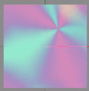
(The yellow above is actually green on the Switch itself)
Static
This example disables the animation, but still shows the two colors.
You need two colors.
Warning
DO NOT change the alpha channel in this example (keep the FF and 00). Only modify lowercase bbggrr.
{
    "TargetName": "ResidentMenu.szs",
    "Files": [
        {
            "FileName": "blyt/Cursor3.bflyt",
            "Patches": [
                {
                    "PaneName": "P_Main",
                    "UsdPatches": [
                        {
                            "PropName": "C_B",
                            "PropValues": ["0", "0", "0", "0"],
                            "type": 1
                        },
                        {
                            "PropName": "C_W",
                            "PropValues": ["0", "0", "0", "0"],
                            "type": 1
                        },
                        {
                            "PropName": "S_BorderColorSelect0",
                            "PropValues": ["0"],
                            "type": 1
                        },
                        {
                            "PropName": "S_BorderColor0",
                            "PropValues": ["0", "0", "0", "0"],
                            "type": 1
                        },
                        {
                            "PropName": "S_DropShadowColorSelect",
                            "PropValues": ["0"],
                            "type": 1
                        },
                        {
                            "PropName": "S_DropShadowColor",
                            "PropValues": ["0", "0", "0", "0"],
                            "type": 1
                        }
                    ]
                },
                {
                    "PaneName": "P_Grow",
                    "Visible": false
                }
            ],
            "Materials": [
                {
                    "MaterialName": "P_Main",
                    "BackgroundColor": "FFbbggrr", // set your first color here
                    "ForegroundColor": "00bbggrr" // set your second color here
                }
            ]
        }
    ],
    "Anims": [
        {
            "FileName": "anim/Cursor3_Wait.bflan",
            "AnimJson": "{\"LittleEndian\":true,\"Version\":150994944,\"pat1\":{\"AnimationOrder\":0,\"Name\":\"Wait\",\"ChildBinding\":90,\"Groups\":[\"G_Wait\"],\"Unk_StartOfFile\":0,\"Unk_EndOfFile\":0,\"Unk_EndOfHeader\":\"ACoDAAAAAA==\"},\"pai1\":{\"FrameSize\":720,\"Flags\":1,\"Textures\":[],\"Entries\":[]}}"
        }
    ]
}
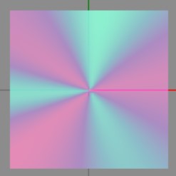
Result
Plain
This example disables the animation, removes the pattern, and changes the cursor to be one or more colors. You can get creative since you can modify the four corners individually.
You need one or more colors.
Info
Note that the ColorXX fields mean the following:
- TL = Top Left
- TR = Top Right
- BL = Bottom Left
- BR = Bottom Right
Warning
DO NOT change the alpha channel in this example (keep the FF). Only modify lowercase bbggrr.
{
    "TargetName": "ResidentMenu.szs",
    "Files": [
        {
            "FileName": "blyt/Cursor3.bflyt",
            "Patches": [
                {
                    "PaneName": "P_Main",
                    "UsdPatches": [
                        {
                            "PropName": "C_B",
                            "PropValues": ["0", "0", "0", "0"],
                            "type": 1
                        },
                        {
                            "PropName": "C_W",
                            "PropValues": ["0", "0", "0", "0"],
                            "type": 1
                        },
                        {
                            "PropName": "S_BorderColorSelect0",
                            "PropValues": ["0"],
                            "type": 1
                        },
                        {
                            "PropName": "S_BorderColor0",
                            "PropValues": ["0", "0", "0", "0"],
                            "type": 1
                        },
                        {
                            "PropName": "S_DropShadowColorSelect",
                            "PropValues": ["0"],
                            "type": 1
                        },
                        {
                            "PropName": "S_DropShadowColor",
                            "PropValues": ["0", "0", "0", "0"],
                            "type": 1
                        }
                    ],
                    "ColorTL": "FFbbggrr", // set your custom color(s) in these four fields
                    "ColorTR": "FFbbggrr",
                    "ColorBL": "FFbbggrr",
                    "ColorBR": "FFbbggrr"
                },
                {
                    "PaneName": "P_Grow",
                    "Visible": false
                }
            ],
            "Materials": [
                {
                    "MaterialName": "P_Main",
                    "BackgroundColor": "FFFFFFFF",
                    "ForegroundColor": "00FFFFFF"
                }
            ]
        }
    ]
}
Result
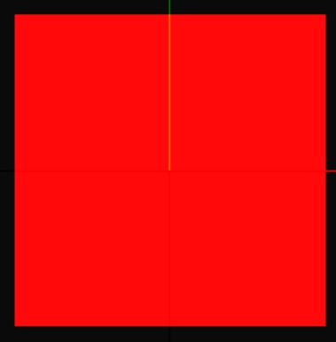
Color value: FF0000FF (red)
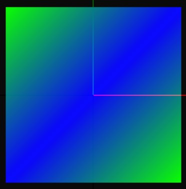
Color values respectively: FF00FF00, FFFF0000, FFFF0000, FF00FF00
Instructions (Advanced)
The cursor color actually consists of four things:
1. Material Color
The material colors are what is visible in the gif. The following are the default values:
P_Main
- BackgroundColor/White Color:
rgb(0,193,242) - ForegroundColor/Black Color:
rgb(0,221,165)
P_Grow
- BackgroundColor/White Color:
rgb(22,158,244) - ForegroundColor/Black Color:
rgb(0,204,44)
Set you custom colors in the P_Grow materials. Set P_Main to a slightly lighter variant of your colors.
You always want to the ForegroundColor/Black Color to have opacity 0 (default). If it doesn't, the middle (so it covers the whole button instead of just the edge) of the cursor will be filled with the color as well. If you work in layouts directly, this color has to be in the hex AABBGGRR format.
2. USD Color
Both panes also have a USD section with C_W and C_B set. The following are the default values:
The USD Color actually overwrites the Material color. This way, the material color can dynamically change based on the system theme (Light/Dark).
Set the USD sections as follows to disable this:
3. Border Color
The border has an animation that makes it flash in an even lighter color. This will be a very light blue if you don't disable it. Set the USD sections as follows to disable this:
P_Main/P_GrowS_BorderColorSelect0:0S_BorderColor0:[0, 0, 0, 0]
You can optionally set S_BorderColor0 to something custom, in order to make the cursor look a bit more vibrant/alive.
4. Shadow Color
The cursor also has a shadow to add a bit of depth. By default it adds a slight blue tone, but nothing noticable. Set the USD sections as follows if you like to disable this shadow.
P_Main/P_GrowS_DropShadowColorSelect:0S_DropShadowColor:[0, 0, 0, 0]
You can optionally set S_DropShadowColor to something custom, in order to make the shadow also match your color.
5. Animation
I recommend you use the Switch Toolbox if you want to mess with it yourself (In LayoutKit: Settings > Preferred editor > Switch-Toolbox). It can preview what your animation will look like (not border, shadow etc. Just material color animation). If you don't, there are examples further up this page.
With custom animations you can animate the four corners of a material separately and possibly make it look very cool.
Warning
If you experience unexpected behaviour, note that Switch Toolbox sort of breaks a layout file. It seems to break border animations for example.